|
 |
 |
 |
 |
 |
 |
Section 1: The Basics

The
Epidemic
Wave
Contents:
- What is an epidemic wave?
- Origins of the epidemic wave.
- South Pacific island case study
- Pacific island epidemic wave
- Repeated epidemic waves
B:
Think of a Mexican Wave created by spectators at a football match standing up and sitting back down again in unison and in sequence.
The effect is dramatic, but it does require the behaviour of individuals to be ordered in time and space. When and where are critical.
This is true for epidemics too.
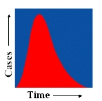
An epidemic wave is a graph which traces the development of an epidemic over time and/or space.
To keep matters simple, let us begin by focusing on just the temporal dimension (time). The epidemic wave on the left plots new cases against time.
During an epidemic the number of new cases (infected individuals) increases rapidly to a peak and then falls more gradually until the epidemic is over.

In the nineteenth century statisticians and medical scientists began to look for patterns and order in their data on epidemics. They noticed some distinct regularities.
One likened what he found to 'the waves on an enriged sea'.
This idea of an epidemic wave has proved to be particularly useful. Not only does it help to describe accurately the number of individuals who have been infected by the disease in question (new reported cases), but it also offers the possibility that the course of the epidemic may be predicted (when it will peak and when it will return to the original level, for example).
For this reason scientists drawn from many disciplines such as biology and mathematics, and not just specialist epidemiologists, have become interested in the subject.

South Pacific island case study
Suppose that we live on a beautiful, but small (population 400) and very isolated South Pacific island. One day a ship arrives bringing a new infectious disease previously unknown to the islanders.
Infection of the susceptible population (those not previously infected by the disease) takes place rapidly and, because the incubation period for the disease is short, islanders quickly begin to infect each other.

Of the 400 islanders 71% contract
the disease and the death rate is 36%.
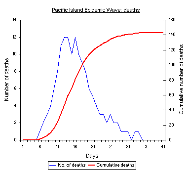
The graphs below show the epidemic waves for our island.
|
|
|
|
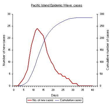
The graph on the left shows how the number of new cases (people infected by the disease) rises to a peak and then gradually falls off until the epidemics is over. The cumulative number of cases rises and then plateaus).
The graph on the right shows the same pattern for the number of people who die from the disease each day (rises then falls again) and the cumulative number of deaths (rises then plateaus).
The epidemic is over when there are no more new cases and no more reported deaths.
Time is shown along the horizontal (x axis) of each graph, and the number of new cases or deaths on the vertical (y) axis.
As well as this, both graphs have a second vertical (yy) axis which is on the right of each graph. These axes are used to show the cumulative (that is the total so far) number of deaths or new cases.
Click HERE to see a clickable graph which shows this data on the same graph and also has a line which shows the number of susceptibles (people who haven't caught the disease).
Each of the four time-series curves shown in the graphs on the left follows a characteristic signature shape now regarded as typical for an isolated epidemic.
Each epidemic disease has its own infection and case fatality rates which will influence the timing and effect of its spread in normal conditions. The typical patterns are captured by our Pacific island example.
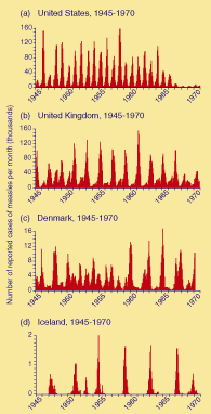
It is often the case that the same epidemic disease returns at regular intervals to attack the new members of a population and those who are still susceptible to contracting the disease.
Before immunisation was introduced the common infectious diseases of childhood, such as measles, whooping cough, scarlet fever, German measles (rubella) and, to some extent, smallpox, reappeared in epidemic form to target those children born during the previous two, three or four years since the last outbreak.
The most dramatic illustrations of these repeated epidemic waves are provided by measles. Examples from the USA, the United Kingdom, Denmark and Iceland appear on the left.
Click on the graphs or click here
to see enlarged versions