Section 1
B: The Epidemic Wave
Repeated Waves
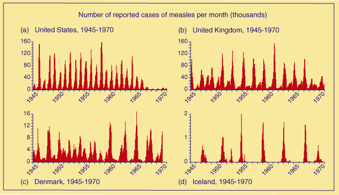
Graphs re-drawn from Cliff et al. 1981, p.159
It is easy to see that while all four graphs show repeated epidemics, the curves of which are similar in shape, there are clear differences between the four countries. The peaks are close together for the USA indicating frequent epidemics occurring about every year), more spaced out for the UK (about every 2 years), even more so for Denmark (about every 3 years) and very widely spaced for Iceland (about every 8 years).
Population
One clear difference is in the amount of time between epidemics (space between peaks on the graph).
This difference is because of the different population sizes of the countries.
Thinking back to the Pacific island example, the number of susceptibles (people who haven't had the disease, but who could get it) decreased as the epidemic progressed - as more people got the disease or died as a result of it.
For an epidemic to progress, there needs to be a supply of people who are susceptible, who then get infected and so the peak on the graph grows.
The gaps between the peaks on the graphs above show the amount of time it took for the number of susceptible people to build up again after an epidemic.
The increase in the number of susceptibles could be due to new people moving to the area, but in the case of measles it is most likely to be the number of people who are born. The gap between the peaks will therefore be smaller for places with more people (higher populations).
The populations of the four countries were: USA 210 million (peaks approx. every year); UK 56 million (peaks approx. every 2 years); Denmark 5 million (peaks approx. every 3 years); Iceland 0.2 million (peaks approx. every 8 years).
Public health
Another important influence on epidemics and so on the shape of the graphs above is public health campaigns.
This can be clearly seen in the case of the USA. The peaks get lower (fewer people are infected) at the end of the graph. This is a result of vaccination campaigns started in the mid-1960s.
The number of susceptibles was reduced as people who were successfully vaccinated could no longer be infected.