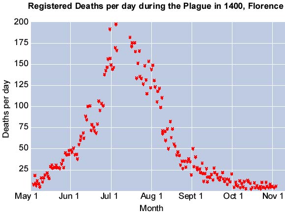
As mentioned, because the Italian data are so good it is also possible to look at the seasonality of deaths during a plague epidemic. Once again, there is a very distinctive pattern shown on the graph above. Look back at the graph showing plague seasonality in London (click here). Note that the peak is later in London due to the different latitude, and therefore climatic conditions.
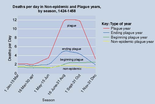
This seasonal pattern is even more striking when we compare plague and non-plague years. The example of Florence can be used afain, to establish the typical patterns in the years 1424-58. Bubonic plague had a very marked early summer focus in its epidemic form coinciding with greater mobility in the rat and flea populations after winter. This can be seen in the graph below.
As you can see form the graph, there is a distinct pattern with the maximum number of deaths per day occurring in early July in the example from Florence in 1400 shown below. In Northern Europe the peak usually came later in the year; in August rather than July.